Data visualization misinterpreted
Business summary: Data visualisation is often misinterpreted as creating a cool report, instead meaningful simple bar chart.
A short story at the beginning. I recently received a dashboard that was supposed to be designed by someone experienced in data visualization. We sent a set of basic e-commerce metrics such as impressions, clicks, sessions, costs, etc. and we wanted to see them visualized in a dashboard. The result we got was a disaster. No time comparison possibility, trend line used for non-trend data, bar chart with some values in millions and some in thousands → impossibility to compare smaller values between them, etc. If there was just a simple table with descending values, it would be easier to understand the numbers. So I asked an "analyst" who prepared it: "What is your data visualization experience?" and reply was: "I created a lot of reports for our clients". It was a new information for her that data visualization isn't about creating a report. And a bit strange look couple of seconds after I said that.
Wrong interpretation
That's definitely not a unique case and is of course extreme. Lots of analysts still think that visualization is about using some chart and that's it. And if it looks fancy even better. Nice idea, but very mistaken! We forget about the most basic principle that visualization should help us with easier understanding the data. At first, we should think about what information we want to visualize and then the next step is how to visualize it. Innovation and creativity are not your best friends here.
How NOT to do it!
For better problem illustration, let's have a look at two examples I've seen recently. The first one is suppose to visualize startupists profile by age and education.
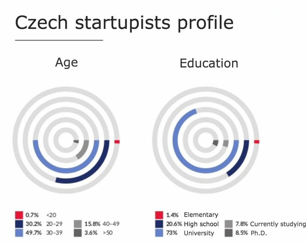
Your reaction is probably WTF?! and so was mine. That's the example of trying to have cool chart. Instead of that, it's absolutely useless mess. It's basically impossible to visually compare elementary education and Ph. D. In fact it's six times less, which is not just impossible to see from the chart, but what is worse, various size of circles completely distorts visual perception of differences between values. Simple table with numbers would definitely be a lot better. Let's abstract from a formal mistake that summed up numbers are more than 100% :) and try to simplify it a bit.
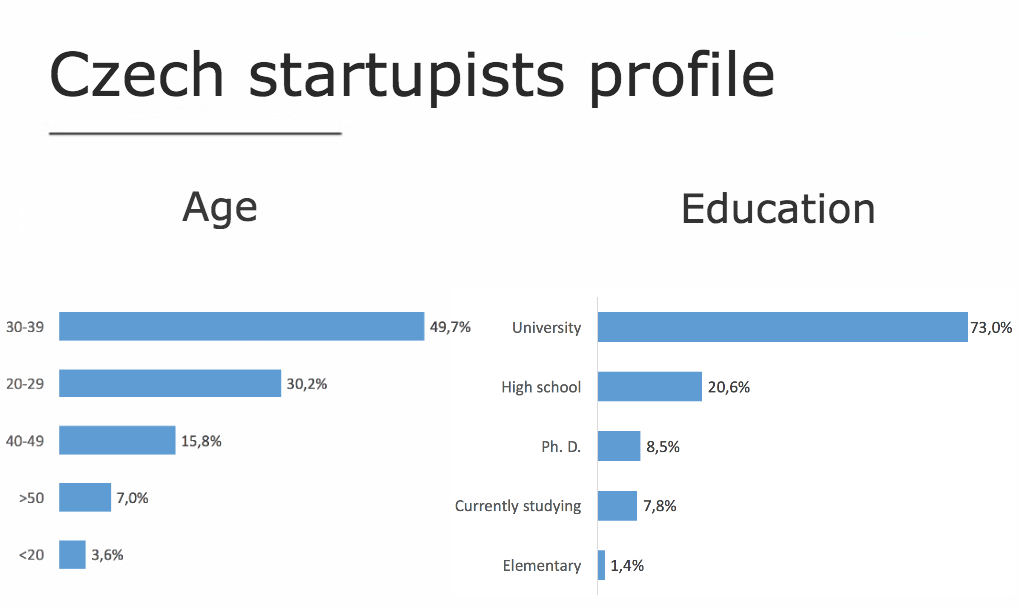
It's nothing new and maybe not that cool, but it is useful. Simple bar chart with descending values and numbers on the right for better understanding the data.
The second example should visualize a YoY change in revenue from categories. Try to do a five second test and find out, which category is the worst in YoY comparison.
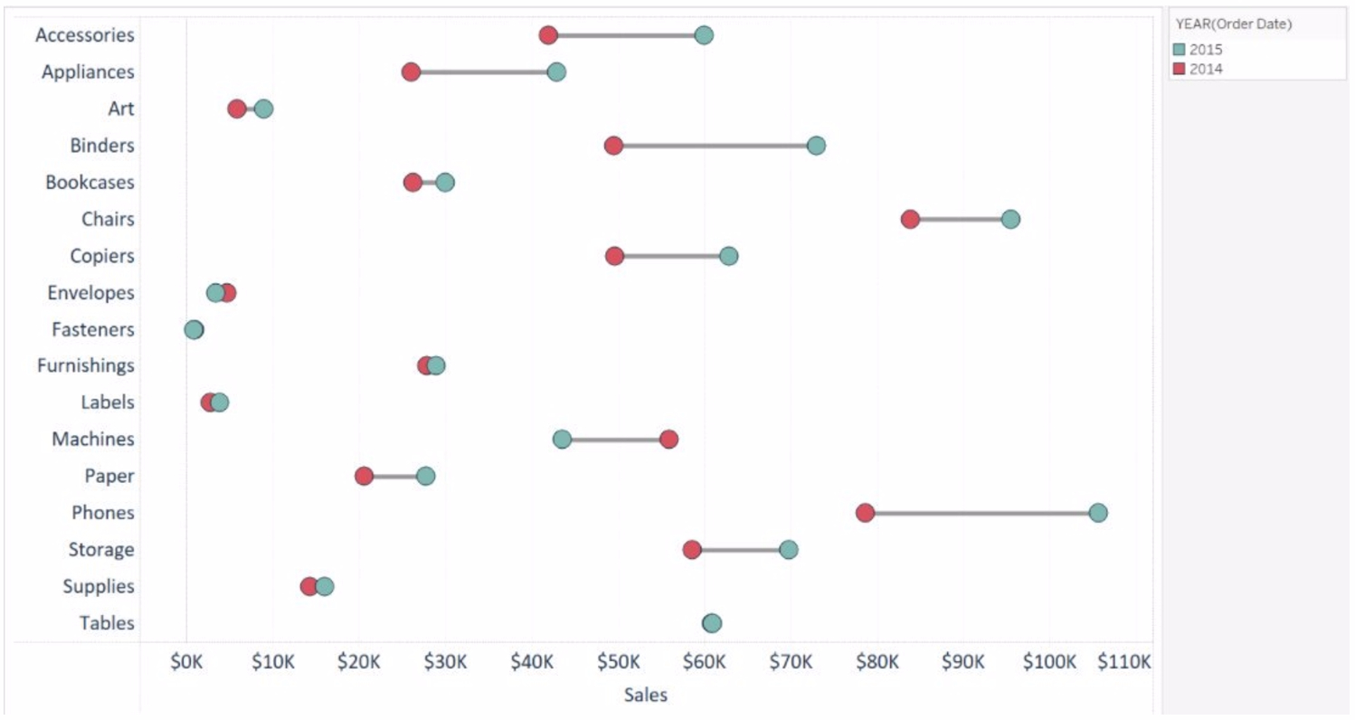
So, if you were focused enough and have bright sight, you've noticed that the worst one are Machines. The first bad choice are colors. We all associate red with decrease and green with increase. This isn't a case where it applies, so it shouldn't be used. It's not easy to distinguish which one performed the best and which one the worst in both absolute and relative change, which makes this visualization useless. So, let's simplify again.
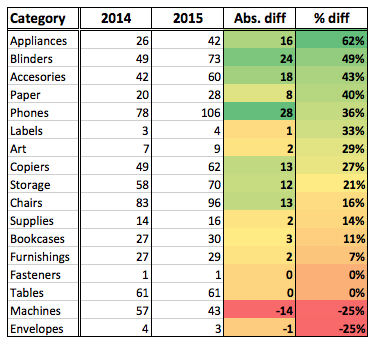
Again nothing new. Just very simple table with descending values by % difference. For easier understanding I use traffic light conditional formatting to see the correlation between relative and absolute changes.
Back to basics
Amazing tools like Tableau or Power BI give us a new cool data visualization possibilities. Unfortunately in most of the cases it's just cool. Nothing more. We tend to have a nice looking chart instead of useful one. The problem is that most of true Analysts do the first 80% of work amazingly. Starting with hypothesis, all the data mining and cleaning and finally a great solution or recommendation. And now it comes to the way we share the results. This is the point, where it's very easy to screw all the work and we fail too often at this part. The last 20%, where we sell our results and all the hard work is probably the most important part. So it's not necessary to be innovative at any price. Just stick to the basics and think about visualization as a way of the easiest understanding the data. The way you visualize the data is nothing but user experience for your analysis recipient. In most of the cases it will be just a bar chart or a trend line, so don't shy to use them. Sometimes it's enough to just write three sentences that deliver important message instead of twenty line table.
Happy visualizing :)